Appearance
Shared Elements
Module: Shared Elements Where to find it: Inside a site → site menu (the apps grid icon) → Shared Elements (or the site dashboard hot‑links). Scope: Per site and per environment — pick the environment tab before working. Who should read this: Administrators who want to build a block of markup once and reuse it across many pages and layouts. Builds on: Pages and Layouts — a shared element is built with the same editor and the same versions & lock model.
1. Overview
A Shared Element is a reusable bundle of HTML + CSS + JavaScript that you build once and drop into multiple pages and layouts. It's not a configurable component — it's a fixed group of markup, styles, and scripts that travel together (e.g. a call‑to‑action block, a promo banner, a greeting card).
A shared element is built in its own UI canvas, which is the same builder as pages and layouts (HTML elements, components, menus, CSS, JavaScript, embedded CSS/JS, preview, versions, lock/release) — including the same rules for which tags you can add (note: a shared element can't be nested inside another shared element). Two things set it apart:
- No language. Like layouts, shared elements are not language‑specific — there's no language switch; they have a single set of content and versions.
- No external URL. It isn't a page, so there's nothing to open in the browser on its own.
- Styling is scoped. A shared element's CSS applies only inside that element, not to the rest of the page (see §5).
Shared elements are environment‑scoped and promote between environments through the Sync Manager — sync a shared element together with any page/layout that uses it.
2. Prerequisites
Shared Elements use their own privilege group (…SE…):
| Action | Privilege |
|---|---|
| View shared elements | Can View Shared Elements (CVSE) |
| Add a shared element | Can Add Shared Elements (CASE) |
| Edit a shared element | Can Edit Shared Elements (CESE) |
| Delete a shared element | Can Delete Shared Elements (CDSE) |
| View / Edit the builder | Can View / Edit Shared Element UI (CVSEUI / CESEUI) |
| Add / Edit / Delete versions | CASEV / CESEV / CDSEV |
3. Creating a shared element (directly)
Open Shared Elements, pick the environment, and click Create Shared Element. Like a layout, it needs only a name (e.g. "Greeting").
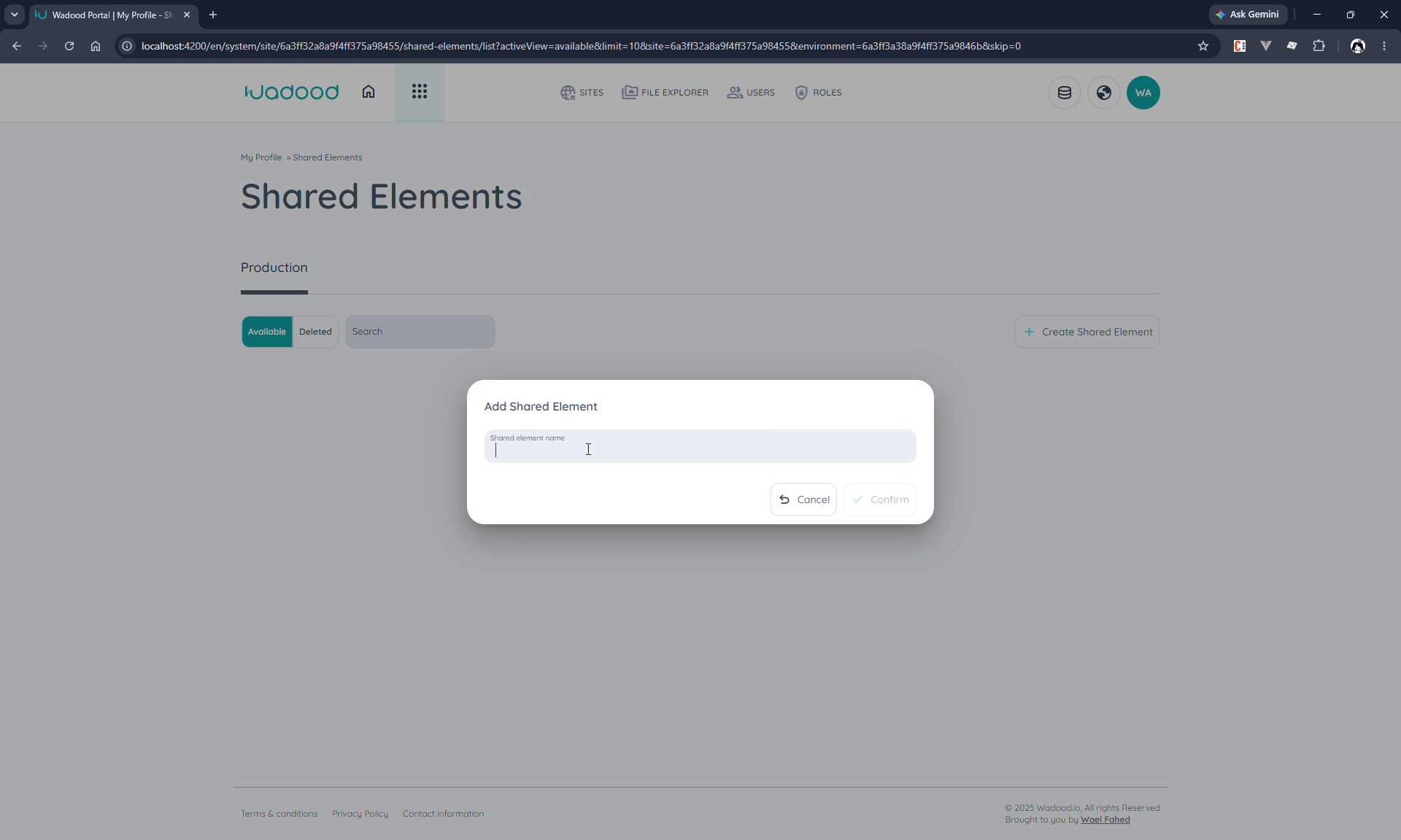
Confirm and the Shared Element UI opens directly, with a First Version already published.
Building it
Lock the version (read‑only until locked), then build like any page/layout:
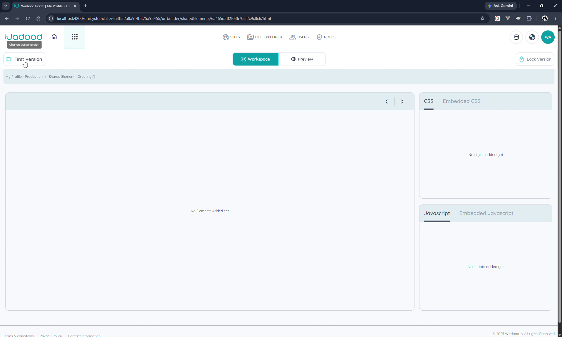
- Add HTML elements (e.g. a
sectionwith anh3and ap), style them via the CSS panel (named style blocks), and add JavaScript / Embedded CSS/JS as needed. - Components and menus can be added too — but you cannot nest another shared element inside a shared element.
Save, make sure the version is published, and release the lock so it's editable by others. See Pages Part 2 for the full versions/lock model (it's identical here).
4. Using a shared element in a page or layout
In the page (or layout) builder, lock the version, then click Add Shared Element, Select your shared element, Confirm, and Save.
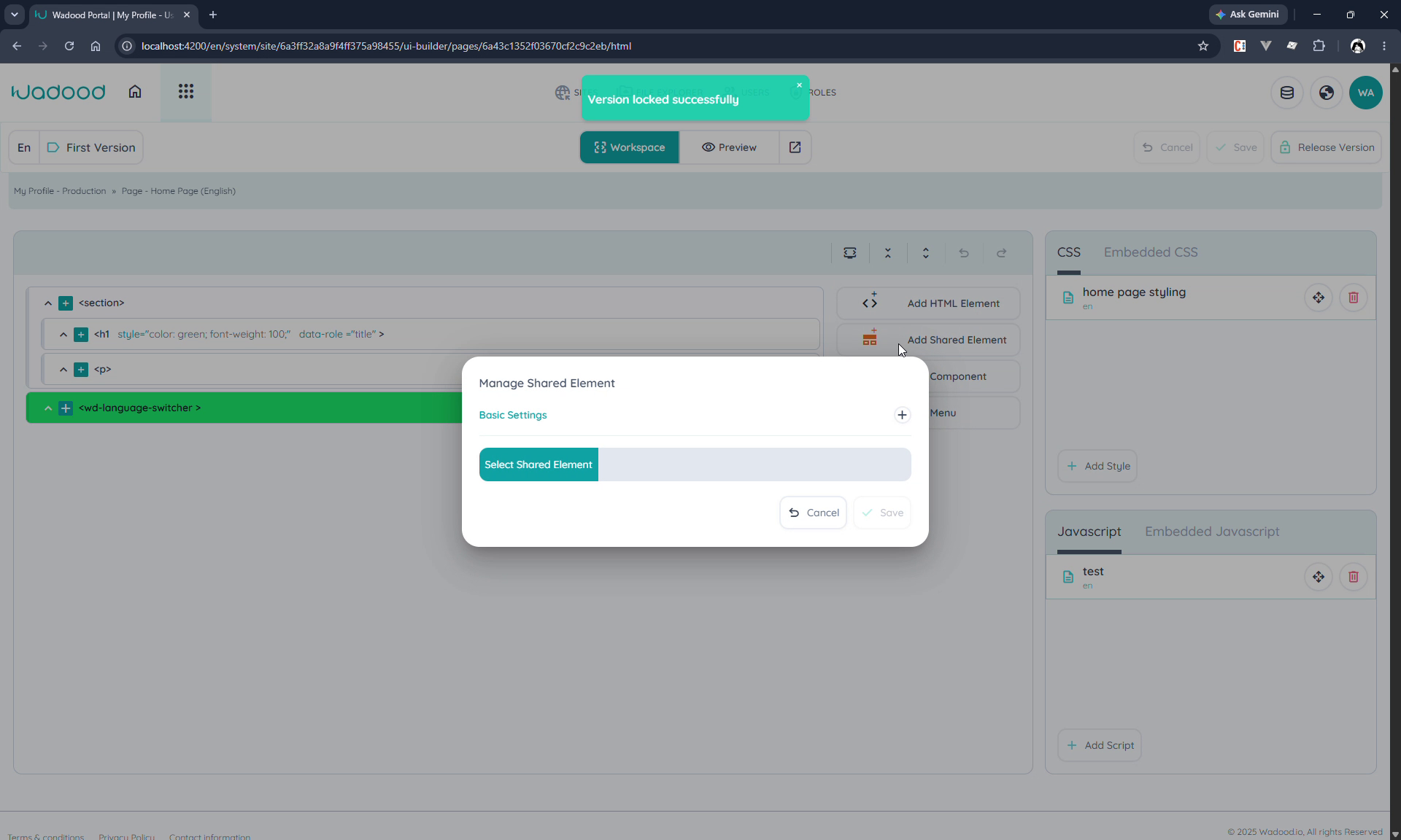
The shared element is inserted by reference — it appears as a <shared-element> node in the tree. As with layouts, you can't edit the shared element's internals from the page; edit the shared element itself and every page/layout using it updates.
Which shared-element version is used? The published version of the shared element is always the one rendered inside the host page/layout — never a draft/active version. So changes to a shared element go live everywhere it's used only once you publish the new version.
5. How it renders — scoped styling
When rendered, a shared element is wrapped in a container marked data-role="w-shared-element" with an element reference id, and its styles are scoped to that wrapper.
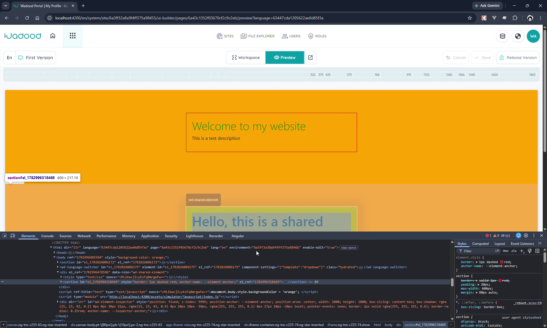
This means the shared element's CSS only affects its own contents. For example, if the shared element styles h3 { color: green }, only the h3 inside the shared element turns green — other h3s elsewhere on the page are unaffected. This encapsulation lets you reuse a block anywhere without its styles leaking into (or being overridden by) the host page.
When you select the shared element in the page builder, its breadcrumb shows it as a shared element; it's a root node (no parent inside the page's own tree).
6. Creating a shared element by conversion
The second way to make a shared element is to convert an existing group you've already built in a page or layout. Select the top/containing element of the group and click Convert to shared HTML group in the element toolbar.
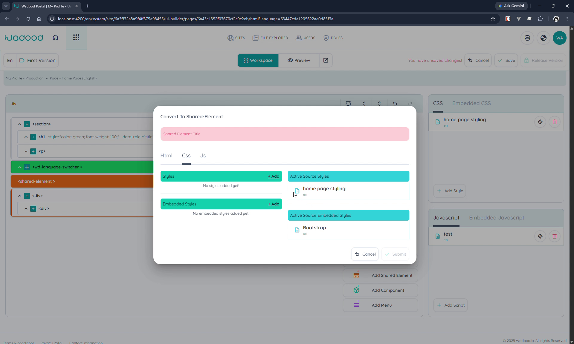
The Convert To Shared Element dialog opens with a Shared element title and tabs for HTML / CSS / JS:
- HTML — shows the markup that will be included in the shared element.
- CSS / JS — you can add styles/scripts directly, and there's a column of the host page's current (Active Source) styles/scripts so you can copy the relevant rules into the shared element.
Give it a title and submit. The selected elements are removed from the page and replaced with a reference to the new shared element, which now appears in the Shared Elements list (open/preview it like any other).
7. Deleting
- Soft delete moves a shared element to the Deleted tab (restorable); it's blocked if any version is locked.
- Hard delete removes it permanently (cascading its versions, settings, and elements).
Deleting a shared element affects every page/layout that references it — check what uses it first.
8. Tips & common pitfalls
- Build once, reuse everywhere — edit the shared element and all references update; you can't edit it from within a host page.
- Styling is scoped — a shared element's CSS won't leak to the page, and the page's CSS won't style its internals. Put the styles the block needs inside the shared element.
- No language and no nesting — shared elements aren't language‑specific, and you can't place a shared element inside another one.
- Convert to reuse existing work — if you've already built a block on a page, convert it instead of rebuilding, and pull its styles/scripts across in the convert dialog.
- Sync dependencies together — when promoting environments, sync a shared element alongside the pages/layouts that use it.