Appearance
Forms
Module: Forms Where to find it: Inside a site → the site apps menu (the grid icon) → Forms, or via the site dashboard shortcut. Scope: Per site and per environment — pick the environment (e.g. Development / Production) at the top of the list before working. Who should read this: Administrators who build the forms that site visitors fill in (contact, subscribe, register, etc.) and who review the resulting submissions.
1. Overview
A Form is a set of input fields that you build here and then inject into a page (as a form component). On the live website, visitors fill the form and submit it; each submission is stored and shown back to you under that form's User Submissions.
Placing & styling the form on a page → this guide covers building the form (fields, validation, rules, submissions). To add the form to a page/layout and theme its look with CSS variables, see The Form component (
wd-form).
The typical journey is:
- Build the form — give it a name, choose what happens on submit, and add fields.
- Place it on a page using the page builder's form component.
- Visitors submit it on the live site.
- You review the submissions (and set a status / add notes) back in this module.
Forms are environment-scoped: a form created in Development lives in Development until it's promoted to another environment via the Sync Manager.
2. Prerequisites
Two related privilege groups govern this module — one for the forms themselves, one for their submissions:
| Action | Privilege |
|---|---|
| View forms | Can View Custom Forms (CVCF) |
| Add a form | Can Add Custom Forms (CACF) |
| Edit a form | Can Edit Custom Forms (CECF) |
| Delete a form | Can Delete Custom Forms (CDCF) |
| View submissions | Can View Custom Form Submissions (CVCFUS) |
| Edit submissions (status/notes) | Can Edit Custom Form Submissions (CECFUS) |
| Delete submissions | Can Delete Custom Form Submissions (CDCFUS) |
To use option‑group‑backed fields (select / typeahead / radio) you'll also want at least one Option Group prepared — see the Option Groups guide.
3. The Forms list
Open Forms. Choose the environment tab at the top, then use the Available / Deleted tabs, the search box, and Create form.
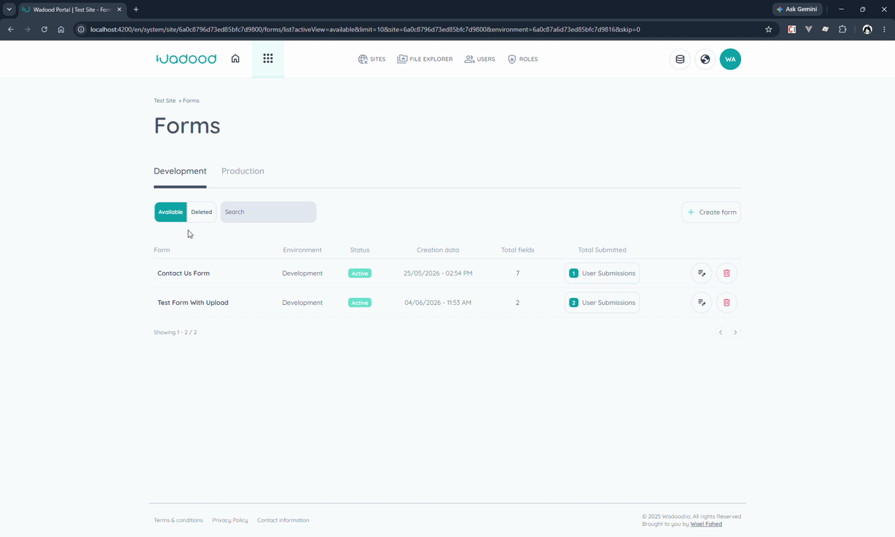
Each row shows the form's name, Environment, Status (Active/Inactive), Creation date, Total fields, and Total Submitted — a User Submissions button that opens that form's submissions and shows the count. Edit and delete actions sit at the end of the row.
4. Creating a form
Click Create form. The screen has a Basic Info section, the field palette (right), and the canvas where placed fields appear. Save with Save All (or Cancel to discard).
4.1 Basic Info
| Field | Notes |
|---|---|
| Form name | Required (e.g. "Contact Us", "Subscribe to Newsletter"). |
| Submit action | What happens after a visitor submits — Navigate to page or Broadcast event (see below). |
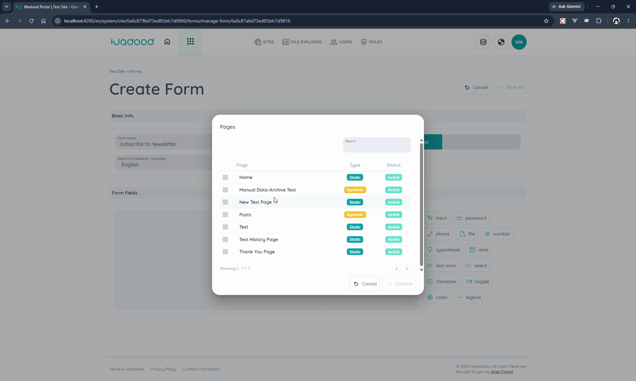
| Destination page | Only when the action is Navigate to page — pick the page to send the visitor to (e.g. a "Thank You" page). The picker lists the site's pages with their Type (Static/Dynamic) and Status. |
| Validation language | The language used for the form's error messages and hints — English, Arabic or French. Match it to the language the form is presented in. |
Submit action — the two options:
| Action | What it does | Extra field |
|---|---|---|
Navigate to page (redirect) | After submit, the visitor is sent to a page you choose. | Destination page (required) |
Broadcast event (event) | After submit, the form component emits an event for your own page scripts/components to react to. Nothing navigates. | — |
4.2 Adding fields (the canvas)
The field palette lists the available input types. Click a type to drop it onto the canvas. A field with a red border is not yet valid/complete — open it with its edit button and fill in the required details. Fields render in the order you place them, and each takes a width based on its Size (below).
4.3 Field details (Manage Control → Control Details)
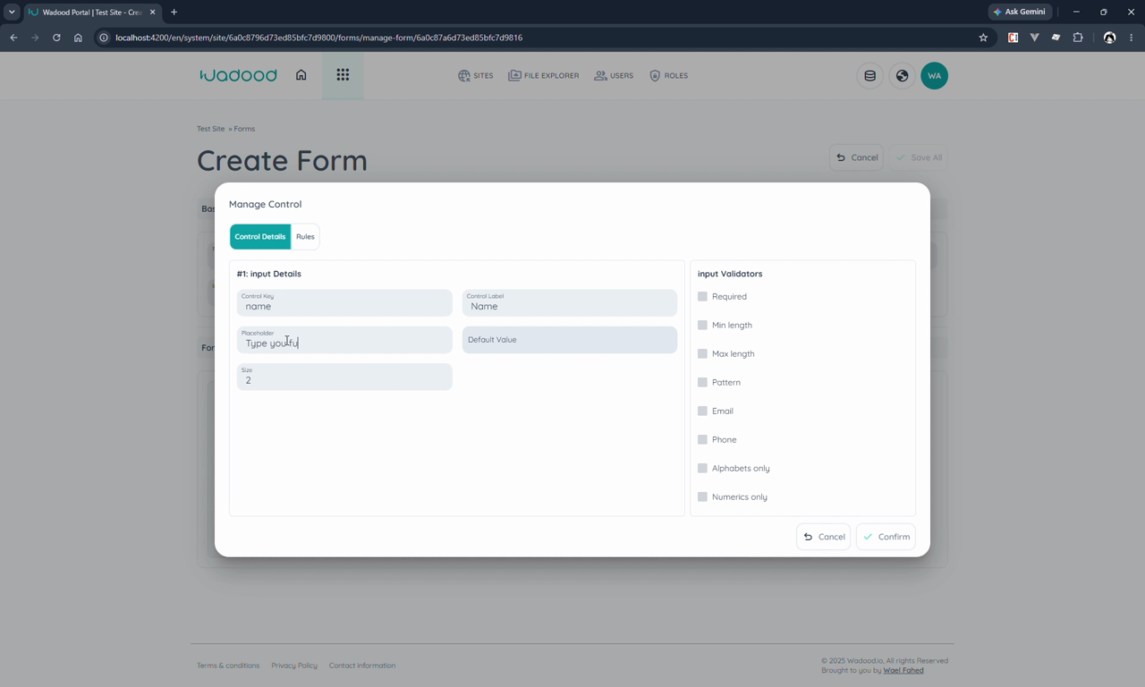
Editing a field opens the Manage Control dialog with two tabs: Control Details and Rules.
| Field | Notes |
|---|---|
| Control key | The key name stored in the database for this field (e.g. name, email). Required; keep it unique within the form. |
| Control label | The visible label shown to the visitor (e.g. "Name"). |
| Placeholder | Optional hint text inside the field (e.g. "Type your full name"). |
| Default value | Optional pre‑filled value. |
| Size | The field's width as a quarter of the form: 1 = quarter, 2 = half, 3 = three‑quarters, 4 = full width. |
4.4 Validators
On the right of Control Details you tick the validators that apply. The available set depends on the field type:
| Validator | Meaning |
|---|---|
| Required | Must be filled. |
| Min value / Max value | Numeric bounds (number fields). |
| Min length / Max length | Character‑count bounds. |
| Pattern | Must match a regular‑expression pattern you provide. |
| Max size (MB) | Upper file size in megabytes (file fields). Capped by the platform at 1 MB — see below. |
| Must be a valid email address. | |
| Phone | Must be a valid phone number. |
| Alphabets only | Letters in any script — Latin, Arabic, Cyrillic — including accents and Arabic diacritics, plus spaces, hyphens and apostrophes, so real names (Anne-Marie, O'Neill, عبد الله) pass. Digits and other punctuation are rejected. |
| Numerics only | Digits only. |
| Must be truthy | Must be checked/on (checkbox & toggle). |
Uploads are capped at 1 MB per file
Max size (MB) can only make the limit smaller, never larger. Wadood refuses any file over 1 MB, whatever the field is set to — so the effective limit is whichever of the two is lower. The form itself now tells the visitor the limit before they pick a file, and refuses an oversized one straight away rather than after they submit.
Worth designing around: photos straight from a phone are usually 3–5 MB, so a "send us a photo" field needs visitors to compress first. If you are collecting large documents, ask for a link instead of an upload.
Which validators each type offers:
| Field type | Available validators |
|---|---|
| Input | Required, Min length, Max length, Pattern, Email, Phone, Alphabets only, Numerics only |
| Text area | Required, Min length, Max length, Pattern |
| Password | Required, Min length, Max length, Pattern |
| Phone | Required, Min length, Max length, Pattern, Phone |
| Number | Required, Min value, Max value |
| File | Required, Max size (MB) |
| Date | Required |
| Select / Typeahead / Radio | Required |
| Checkbox / Toggle | Required, Must be truthy |
4.5 Field types reference
| Type | What it is | Notes |
|---|---|---|
| Input | Single‑line text box. | The most common field. |
| Password | Input whose characters are masked (•••). | |
| Phone | Phone‑number input with a country code. | Has a default country code (e.g. +962). |
| Number | Numeric input with + / − steppers. | Min/Max validators. |
| Text area | Multi‑line text box. | For longer text like a message. |
| Date | Date picker. | |
| File | File upload. | You specify the accepted file types. |
| Select | Drop‑down list. | Backed by an Option Group. |
| Typeahead | Search‑as‑you‑type input that filters a list. | Backed by an Option Group — the visitor types and the dropdown filters. |
| Radio | Radio‑button group. | Backed by an Option Group; also has an option size (1–4) and optional option description. |
| Checkbox | Single checkbox. | |
| Toggle | A checkbox shown as a toggle switch. | Same data as a checkbox, different UI. |
| Legend | A section separator, not an input. | Its label becomes a section title and its placeholder becomes the section description. |
Option‑group‑backed fields: Select, Typeahead, and Radio require you to pick an Option Group (its label/value pairs populate the choices). Build those lists once in Option Groups and reuse them across forms.
4.6 Rules — conditional display & enabling (Manage Control → Rules)
The Rules tab makes a field appear/disappear or enable/disable based on other fields' values.
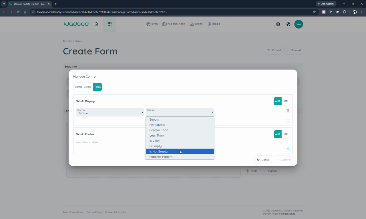
- Should Display — when its conditions are met, the field is shown; otherwise it's hidden from the form entirely.
- Should Enable — when its conditions are met, the field is enabled; otherwise it's shown but disabled (greyed out / not editable).
Each rule is a set of conditions combined with AND / OR. A condition is: Field key + Operator + (optional) value:
| Operator | Meaning |
|---|---|
| Equals / Not Equals | value matches / doesn't match |
| Greater Than / Less Than | numeric comparison |
| Is Valid | the referenced field passes its own validators |
| Is Empty / Is Not Empty | the referenced field has no value / has a value |
| Matches Pattern | the referenced field matches a pattern |
Example: show Email only when Name Is Not Empty AND Is Valid.
4.7 Save
Click Save All. The form appears in the list with its total fields; submissions start at zero.
5. Using the form on a page
A form does nothing until it's placed on a page. In the page builder:
- Add a component and choose Form.
- Select which form to show (e.g. Subscribe to Newsletter) — this renders the
wd-formcomponent. - Save the page, then Preview — the form appears with the fields, sizes, and rules you configured.
Add your own submit button. The form renders the fields, but not a submit button — you add one yourself as content inside the
wd-formcomponent (it appears after the last field). Wire it to call the component'ssubmit()method, and style/place it with normal page CSS. See Form component → Content & slots for the exact markup.
When a visitor submits it, the configured submit action runs (navigate or broadcast event) and the entry lands in User Submissions.
6. Reviewing submissions
From the list, open a form's User Submissions. Each submission can be triaged:
- Status — Unprocessed, In progress, Processed, or Rejected.
- Notes — add internal notes to a submission (e.g. follow‑up details).
(Requires the Form Submissions privileges from §2.)
Deleting submissions is permanent
Forms and submissions behave differently, and it is easy to assume otherwise because the forms list has Available / Deleted tabs:
| What delete does | |
|---|---|
| A form | Moves to the Deleted tab. Recoverable — you can restore it. |
| A submission | Erased immediately. No Deleted tab, no restore, no undo. |
| A form, deleted permanently from the Deleted tab | Erases the form and every submission under it, including any already deleted, and any uploaded files. |
There is no recovery for either of the last two, so treat them as final. Export anything you still need first.
This is deliberate, and it is useful to you. Submissions contain personal data your visitors gave you — for that data you are the data controller and Wadood is only processing it on your behalf. Because deletion really erases, you can honour a "delete my data" request from a visitor yourself, in the portal, without contacting us and without wondering whether a hidden copy survives.
7. Tips & common pitfalls
- Control key vs. label: the key is the database field name (keep it short and unique, e.g.
email); the label is what the visitor reads ("Email"). The key is what you'll see in submissions. - Red border = unfinished field. A field with a red outline is missing a required detail — open it and complete Control Details before saving.
- Validators are type‑specific. Don't expect "Email" on a number field — each type only offers the validators that make sense for it (see §4.4).
- Select / Typeahead / Radio need an Option Group. Prepare the list in Option Groups first.
- Match the validation language to the form's language so error messages and hints read correctly.
- Use Legends to structure long forms — a legend's label becomes a section heading and its placeholder a sub‑description.
- Should Display hides; Should Enable greys out. Pick the one that matches your intent — a hidden field collects nothing, a disabled field stays visible but locked.
- Forms are per environment. Build and test in Development, then promote to Production via the Sync Manager rather than rebuilding.
8. Known issues (as observed in this build)
The "Validation language" field shows a raw translation key.Fixed. The key exists inen,arandfr, and the label renders normally.