Appearance
Components
What this is: Wadood ships a set of prebuilt web components (custom
wd-elements) that you drop into pages, layouts, and shared elements from the builder — carousels, sliders, tabs, accordions, dropdowns, a language switcher, a form engine, and the overlay set (dialogs, toasts, side drawers). Who should read this: Administrators who add components to a page, and frontend designers who theme them with CSS. Related: Pages · Layouts · Shared Elements
1. What a component is
A component is a ready-made, self-contained piece of UI implemented as a custom HTML element with a wd- prefix (e.g. <wd-slider>, <wd-tabs>). You don't build its internals — you add it, configure its settings, optionally put content inside it, and style it with CSS variables.
Every component shares the same two inputs:
componentSettings— the component's configuration, produced by its settings form in the builder (see §3).elementId— an id you can set; it also powers the::part()styling hook (see §4).
2. The component catalogue
Components are organised into five categories (tabs in the picker):
| Category | Component | Tag | What it does |
|---|---|---|---|
| Promo | Cards Carousel | wd-cards-carousel | A horizontally scrolling row of cards. |
| Promo | Slider | wd-slider | A slideshow (slide or fade), optional autoplay, RTL-aware. |
| Promo | Expandable Image | wd-expandable-image | A clickable image (static or $-bound) that expands into a full-screen lightbox. |
| Content | Accordion | wd-accordion | Collapsible, expandable sections. |
| Content | Localization | wd-localization | Inline text pulled from the site's translations. |
| Content | Rich Content | wd-rich-content | Renders a block of rich HTML. |
| Content | Tabs | wd-tabs | Tabbed panels. |
| Navigation | Breadcrumb | wd-breadcrumb | An automatic breadcrumb trail derived from a menu you select — clickable ancestors, current page marked. |
| Navigation | Dropdown | wd-dropdown | A button that opens a menu. |
| Navigation | Language Switcher | wd-language-switcher | Lets visitors switch the site language. |
| Form | Form | wd-form | A full schema-driven form engine (see also the Forms module). |
| Overlay | Dialog | wd-dialog | A modal dialog over a backdrop — invisible until your code opens it with toggleDialog(). |
| Overlay | Toast | wd-toast | Stacking notification toasts triggered from page code — success/warn/info/error, queued, hover-pausable. A snackbar is a documented preset of it. |
| Overlay | Side Drawer | wd-drawer | A full-height panel sliding from the left/right edge — nav menus, filters, carts. Opened with toggleDrawer(). |
3. Adding a component
In the page / layout / shared-element builder, lock the version, then click Add Component. The Select Component dialog opens with the five category tabs.
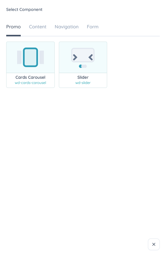
Pick a category, click a component, and the Manage Component settings dialog opens. It has two parts:
- Basic Settings (every component) —
#id, Classes (space-separated), and Inline Style (semicolon-separated). The#idis what you reference in::part()styling. - Component Settings (per component) — the options specific to that component (e.g. the Slider's Transition Type). Each component page below lists its own settings.
Submit to insert it. It appears in the element tree as its wd- tag. To edit a component later, select it and re-open its settings (the same Manage Component dialog).
4. Styling components
Most components render in Shadow DOM, so their internals are encapsulated — your page CSS can't reach inside them directly. There are two supported ways to style them, both used from a page/layout CSS style block:
4.1 CSS variables (the main way)
Each component exposes a set of CSS custom properties named --<component>-* (e.g. --slider-navigation-buttons-background-color, --dropdown-menu-gap). Set them on the component (via its #id or class) and the component reads them through the shadow boundary:
css
#my-slider {
  --slider-navigation-buttons-background-color: #0ea5b7;
  --slider-navigation-buttons-border-radius: 999px;
}
Every component page lists its full CSS-variable table with default values, grouped by what they affect. Components that render into the light DOM or output raw HTML (e.g. Breadcrumb, Rich Content, Localization) expose no variables — style them with ordinary CSS instead.
4.2 ::part() (deep targeting)
Each component also exposes a part named <component>-<elementId> (built from the #id you set in Basic Settings). Use the ::part() selector to style that internal element directly — handy for one-off tweaks a variable doesn't cover:
css
/* a slider whose #id is "hero" */
wd-slider::part(slider-hero) { box-shadow: 0 10px 30px rgba(0,0,0,.15); }
Set an
#idin Basic Settings whenever you plan to use::part()— the part name depends on it.
5. Content & slots
Some components are content-driven — you place ordinary HTML inside them and the component arranges it (e.g. the Slider's slides, the Accordion's sections). Several also expose named slots for specific regions (e.g. the Slider's previous/next arrow content). Others are data-driven and render from their settings or from page data (e.g. the Form, the Language Switcher). Each component page notes its content model, default slot, and any named slots.
6. Component index
- Promo: Cards Carousel · Slider · Expandable Image
- Content: Accordion · Localization · Rich Content · Tabs
- Navigation: Breadcrumb · Dropdown · Language Switcher
- Form: Form
- Overlay: Dialog · Toast (+ the snackbar preset) · Side Drawer